Monday, April 4, 2016

Nike has a good logo because it is simple and everyone remembers what it is and what the brand is. That makes the swoosh enjoyable to me and the rest of the world, making it one of the most popular companies in the world of earth.

I like this logo because its clear that is advertising some sort of rules or "code" for a bar by the beer glass, but at the same time is playing off that word bar code by making the glass an actual bar code as well.

I like this one because it is the word fence that is made to look like a fence. innovation is great man. It isnt 100% noticeably the word fence right off the bat but when you notice is youre all like woah dude.


This Igloo is made out of the word igloo. That is so incredible and creative to me. It makes the word a visual pun. Very memorable and sticky. 


This logo is great because the M for motorola is so memorable and notably unique that the company will definitely be able to market well.  It is a modern brand mark that will mark history forever.


  This logo is pleasurable to my eyes because the word turnt has been  turned in a way that communicates the meaning of the word just by the design.  The letters all look the same expect that they are flipped and turnt to continue to be pleasing to me.

Monday, March 21, 2016

Do you believe your stance is clear within your poster? Defend your answer- image, fonts, color, composition, etc. 
I do believe that my stance on Donald trump is clearly communicated by my poster's images, and writing. I chose images that weren't very flattering along with some of his more ridiculous quotes.

-From your initial thumbnail sketches to your hand drawn draft- Do you feel you were successful in re-creating your poster idea digitally? If not, do you like the new visual outcome? 
I do like the outcome of the poster however it is not very similar to what i drew in the beginning. In search for images to complete the original, i had to compromise with other ideas from what i had to work with. i had to use different composition to recreate the idea as accurately as possible digitally. 

-What were the changes you made from your first version to the last version of the poster? Explain why you made those changes?
i had to change the way parts of the poster looked because i images i was able to collect couldn't be formatted to a way that i desired. 

-Looking over your rubric, which category do you think your project is strongest? Explain why. Which category do you feel the least confident? Explain why.
I think that my design was my best categories because i feel like i used it to communicate my message very well and made my ideas very clear. The category that i am least confident in is my concept because it is not as specific as i may have intended. it is still impeccable though.

-What was the most challenging aspect of the project, conceptually? 
most challenging aspect was the stance that i had to take in order to make the poster. i wasn't sure what the exact message i wanted to communicate was so i went for a general slander of trumps name.

-What was most challenging about the project, technically?
finding the right images was the most difficult technically aspect of this project as well as the saving process, i had a lot of difficulty when the computers were wiped because i only saved my work and not the source images because the thought the program saved them like most ones do. 

Wednesday, January 13, 2016

Blog Reflection
1.     What is your self symbol concept?  How did you arrive to this idea for your self symbol project?  How does your image/action relate or enhance your concept?
My concept is how the truth hurts and i came upon this when a new truth was revealed to me and it hurt me very much.  The eyes open and show blood dripping to show pain.

2.     Post your GIF onto the blog- must upload through Insert Photo function  (not video) and must use .GIF format


3.     How has your animated GIF evolve from it’s original idea (thumbnail and post it notes) through the use of Photoshop? 

Tuesday, January 12, 2016

Ive seen many post online ranging from basically everything possible.

I saw and agreed with a post that was talking about how awful of a human Donald Trump is and i agreed with it very much. He is trash.

I like political videos that show new viewpoints on current issues such as how awful Trump is.Other people disagree with this because they are most likely awful as well. They are wrong because they don't know any better.

Immigration
Drug policy
Terrorism

Wednesday, November 18, 2015

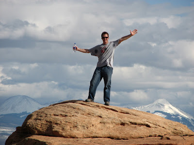
My concept is how godly I am. On top of a mountain, resembling a Hindu god with 6 arms, and the holiest of all birds, the Bald Eagle, flying above me, I look like a god.
Presenting to you, "Bole, Mountain Protector".

I am very happy with the results. 

In order to complete this project, I started with my original 3 photos of myself and selected myself out of each photo and layered them on another page. After cleaning them up, I put them on top of each other in order to make them look like they are all a part of me (used the smudge tool and blur tool to make that effect). I then used layer masks to choose the parts of my body that i wanted to add to the background image. I then positioned my body on top of the photo to line up with the preexisting legs(because the legs in my own photo didn't come out well). i then copied in a photo of an eagle and copied and pastd another layer of my head which i warped and inversed its color.